Color Workflow
How to Convert HEX to Pantone for Print Projects
A practical workflow for turning a screen color into a reliable print conversation, from HEX reference to Pantone shortlist and final proof.
HEX is excellent for screens. It is compact, easy to share, and predictable inside digital design systems. Print is different: paper, ink, coating, viewing light, and press conditions all change how a color is perceived. That is why a HEX value should start the Pantone conversation, not end it.
The goal is not to discover a magic one-to-one conversion. The goal is to build a defensible shortlist, compare it against physical references, and give your printer enough context to produce the intended color consistently.
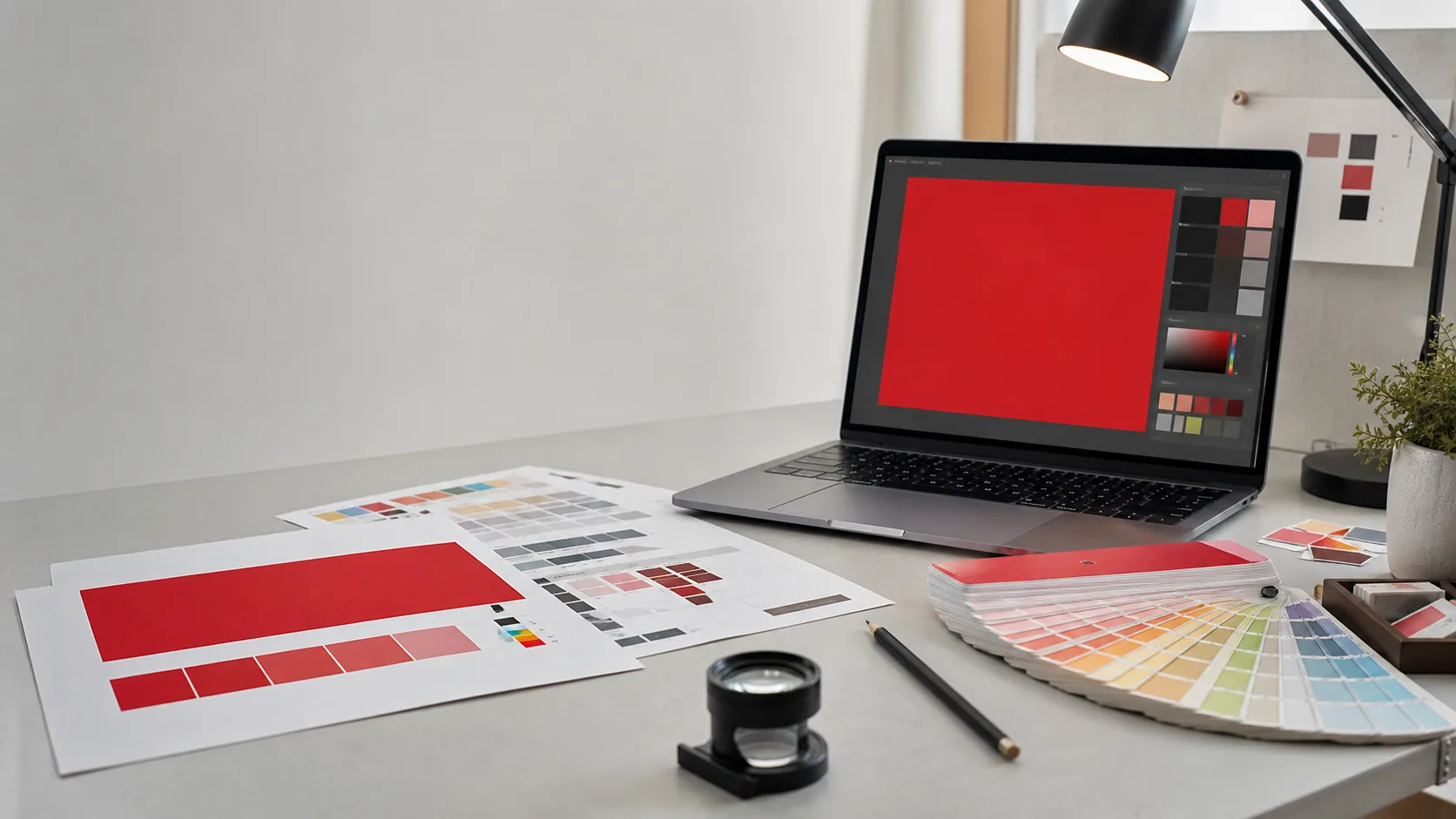
Why HEX Is Not Enough for Print
HEX describes RGB light emitted by a screen. Pantone spot colors describe physical ink standards used in production. Even when two colors look close on a calibrated display, the printed result can shift because ink absorbs and reflects light instead of emitting it.
- Screens vary by brightness, calibration, color profile, and ambient light.
- Paper changes color appearance through whiteness, texture, absorbency, and coating.
- Spot ink, process CMYK, and digital print devices each have different color gamuts.
- A printed proof is judged in reflected light, usually under controlled viewing conditions.
A Practical HEX to Pantone Workflow
1. Normalize the input color
Start with the exact HEX value from the approved digital design source, such as the brand system, design token file, or final artwork. Avoid sampling from screenshots because compression, browser rendering, and display settings can all introduce small shifts.
2. Create a Pantone shortlist
Use a matching tool to create several nearby Pantone candidates rather than a single answer. Compare hue first, then saturation and lightness. A slightly less mathematically close color can be the better production choice if it preserves the brand's visual character.
3. Choose the print context
A color that works beautifully on coated packaging may feel dull on uncoated stationery. Before approving the match, define the material, finish, print method, and whether the final job will use spot color, CMYK process, or a digital press simulation.
| Decision | Why it matters | What to ask |
|---|---|---|
| Coated or uncoated stock | Surface finish changes brightness and saturation | Which Pantone guide matches the final material? |
| Spot or process color | Spot ink is mixed as a named reference; CMYK approximates with four inks | Will this job run as spot ink or process simulation? |
| Viewing condition | Color shifts under warm, cool, or inconsistent light | Can proofs be reviewed under neutral viewing light? |
| Tolerance | Some brand colors need tighter approval than others | How close is close enough for this use case? |
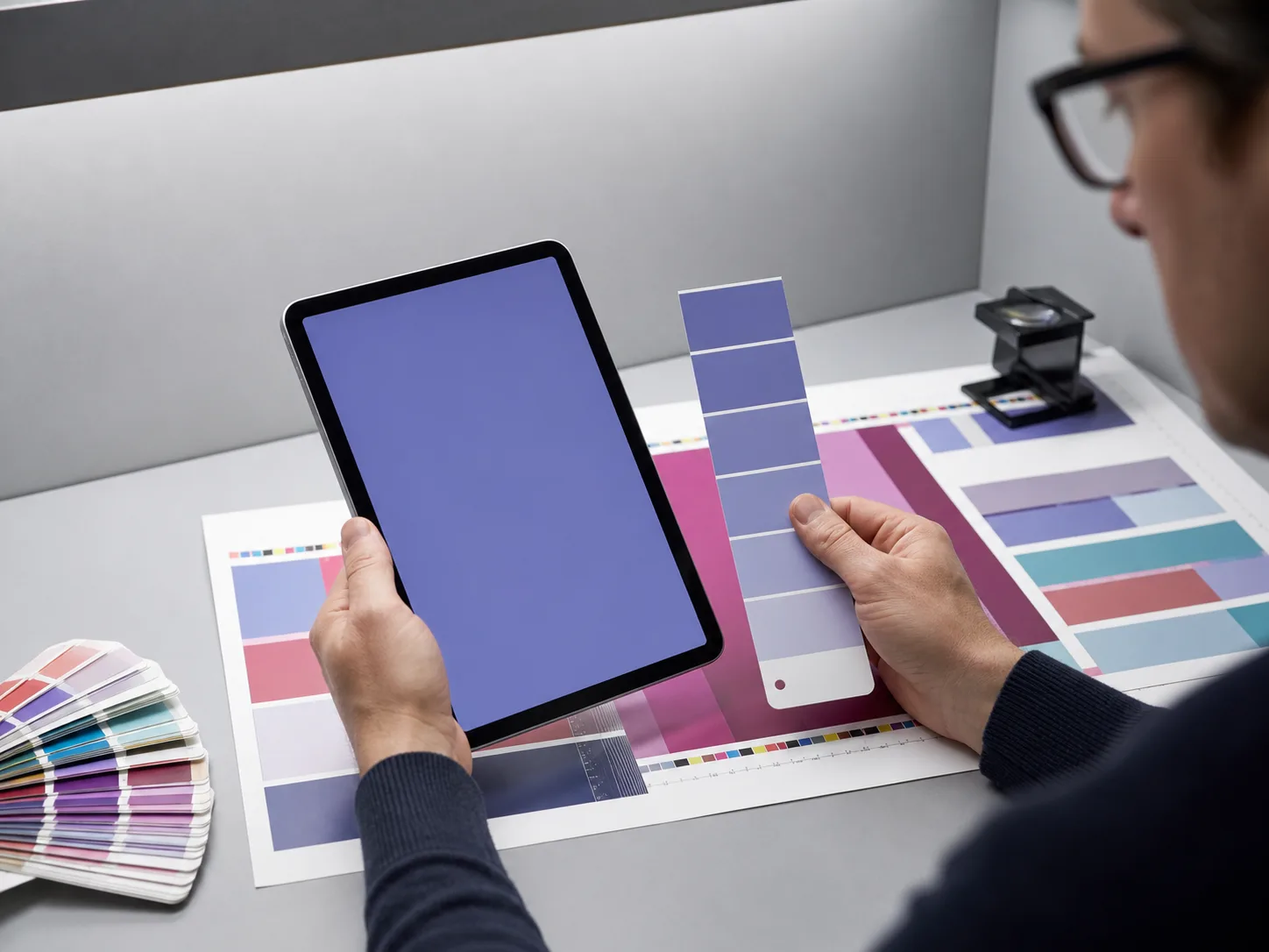
4. Compare physical references
Once you have two or three candidates, compare them against a current physical guide and a printer proof. Do this in the same context the work will be judged: packaging on a shelf, stationery in office light, signage at distance, or fabric under retail lighting.
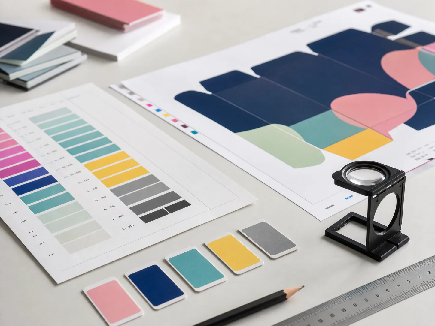
5. Document the final decision
Record the original HEX, selected Pantone name, fallback CMYK or RGB values, stock assumptions, proof date, and any caveats. This turns the match from a guess into a reusable production note for future teams.
HEX to Pantone Approval Checklist
- Use the approved HEX value from the source design system, not a screenshot sample.
- Generate at least three nearby Pantone candidates for comparison.
- Confirm coated, uncoated, or other material expectations before choosing.
- Review a current physical guide and a production proof before final approval.
- Document the Pantone reference, HEX origin, fallback values, material, and proof notes.
Common Mistakes to Avoid
- Approving color from an uncalibrated monitor without a proof.
- Using old or damaged physical guides as the only authority.
- Mixing up coated and uncoated references in a brand guide.
- Assuming the closest numeric match is the best perceptual match.
- Forgetting to tell the printer whether the color is a target, a spot ink, or a CMYK approximation.
FAQ
Can a HEX color be converted exactly to Pantone?
Not exactly. HEX belongs to screen-based RGB color, while Pantone references physical ink behavior. A conversion can identify close candidates, but proofing decides the final production match.
Should I choose coated or uncoated Pantone references?
Choose the reference that matches the final surface. Coated stocks usually make color appear sharper and more saturated, while uncoated stocks can absorb ink and soften the result.
What should I send to a printer after choosing a match?
Send the selected Pantone name, the original HEX value, intended stock or material, proof expectations, and any acceptable fallback values for CMYK or digital production.